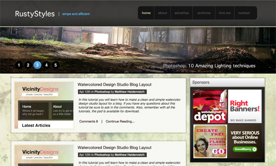
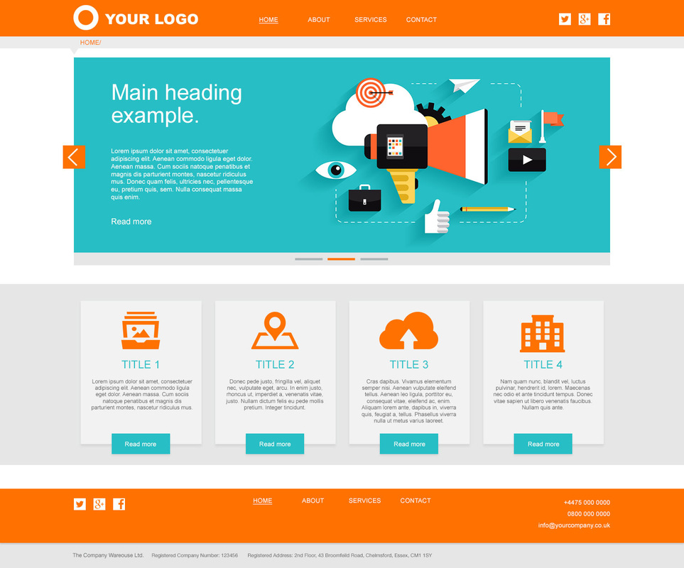
1: Sometimes, simple is better
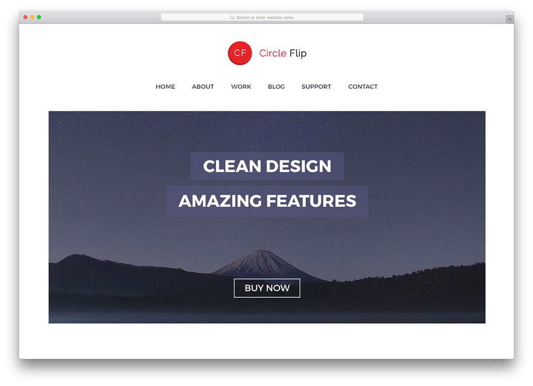
2: Have a dominate object as the main focal point

3: Keep fonts to a maximum of three

4: Overlapping can create movement
5: Every element should align with another
6: Contrast creates intrest
7: Repeat, repeat, repeat! That's harmony!
8: Always face towards the layout
9: Negative (or white space) is golden-keep out